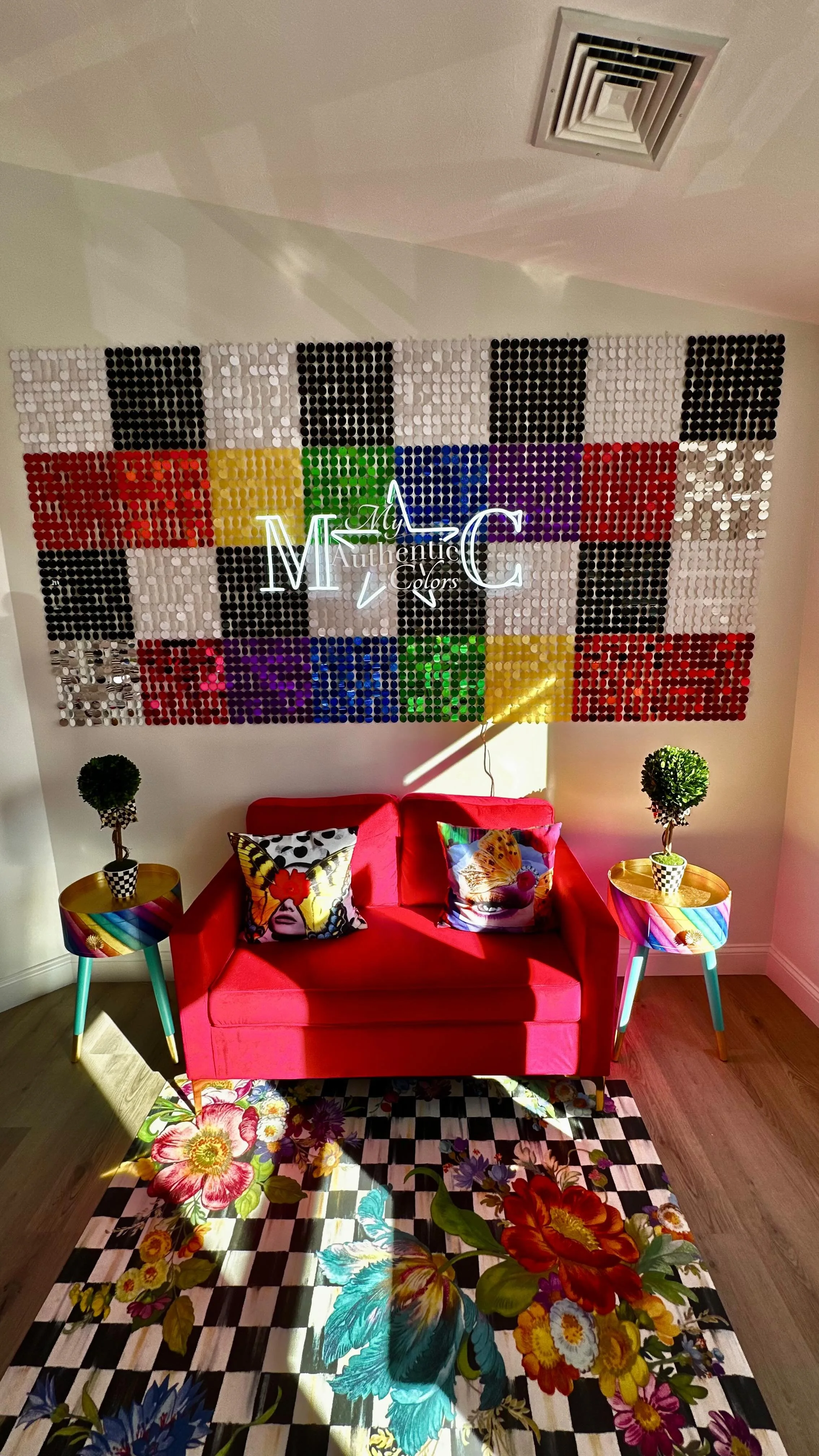
Chapter 12: Aligning Style and Spirit: The Surprising Connection Between Color Analysis and Chakras
Welcome to the twelfth edition of Behind The Drapes—your exclusive, all-access pass to everything going on behind the scenes at My Authentic Colors. This isn’t just about fashion; it’s about uncovering who you are and expressing that with confidence and joy. Whether you're a longtime color enthusiast or just beginning your style journey, I’m so glad you’re here.
🏡 Studio Updates
1st Annual Black Friday in July! 🖤🔥
From 7/21 to 7/31, snag incredible deals on my most popular sessions:
Mini Sessions (60 minutes) for just $75 (regularly $175)
Full 3-Hour Sessions for $175 (regularly $300)
Pop-Up Events now $60 (regularly $100)
Please note: Special discount codes won’t be available until the sale starts and cannot be applied during this event. This is your chance to treat yourself without breaking the bank—don’t miss out!
✨ GIFT CARDS NOW AVAILABLE! You can now purchase Gift Certificates on the website! Here are some directions on how you can purchase Gift Certificates
Head to my website www.myauthenticcolors.com
Click on the Top Right corner and click on “Color Analysis Consultations.”
Click on “Book an In-Person Color Analysis Consultation.”
Scroll to the bottom, where you will find Gift Certificates under “Products & Packages.”
We only have Gift Certificates for the full amount of our Full 3-Hour and Mini (60) Color Analysis Consultations at this time.
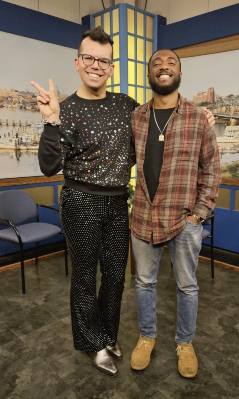
Did you know that I was a guest on the Wake Up New Bedford Podcast? I talk about my journey from being a fitness professional to talking about how I started the journey as a Color Analyst. My episode is broken into two parts and you can watch and listen to them down below.
Did you know that you can host a Private Party with me? This is a fabulous event to do for your employees if you own a business or for a fun girls (or guys) day! Email info@myauthenticcolors.com for more information.
I will be O.O.O from 9/27/25 - 10/7/25 for a work/fun-related vacation to Canada and Chicago. Please plan to book your appointments accordingly!
It’s LEO season, my birthday is coming up, and I will offer a limited discount for my 32nd birthday! For THREE days, I will be offering 32% off FULL Consultations and $32.00 off Mini Consultations. Starts August 13th.
✨ MINI Appointments: Did you know that I started offering 60-minute Consultations every Tuesday and Friday based on your requests? More time, more insights, more YOU.
📅 Upcoming Events
Here’s where you can catch me next—and yes, I’m bringing the full-color energy:
Boutique on the BuyWay
📍 Falmouth, MA | 🗓️ July 31st | ⏰ 4PM - 7PM
Back To School Event at Westend Grill
📍 New Bedford, MA | 🗓️ August 16th | ⏰ 3PM–7PM
Gloria & Co
📍 Marion, MA | 🗓️ October 11th | ⏰ 10AM-3PM
Halloween Extravaganza at Westend Grill
📍 New Bedford, MA | 🗓️ October 18th | ⏰ 3PM–7PM
Community Perk: As part of my vibrant community, you can book a 30-minute Color Analysis Consultation for 20% off with a special discount code “BTD20”—for any of my 30-minute Color Analysis Pop-Ups! Physical Products included in my 3-hour Consultation are not included in my Mini Appointments and can be purchased separately.
Don’t miss your chance to get draped and dazzled at a discount!
Today’s Topic: Aligning Style and Spirit: The Surprising Connection Between Color Analysis and Chakras
When we think of color analysis, we usually picture fashion consultants draping fabric swatches to determine our “season” — Spring, Summer, Autumn, or Winter — to find the hues that flatter us most. But what if there’s a deeper, more spiritual layer to this process?
Enter the chakra system.
Color analysis and chakras may seem like two unrelated worlds — one grounded in aesthetics and personal style, the other rooted in ancient spiritual traditions — yet both operate on a fundamental truth: color affects energy. Let’s explore how these two systems are interconnected and how aligning them can empower your style and your soul.
What Is Color Analysis?
Color Analysis is the practice of identifying the colors that best complement an individual’s skin tone, hair, and eye color. These palettes are grouped into seasonal categories — Light Spring, Deep Winter, Warm Autumn, etc., each with specific tones that harmonize with our natural coloring. The goal is to enhance our natural beauty, confidence, and personal expression.
But these colors don’t just look good — they also carry psychological and emotional energy.
The Chakra System and Its Colors
In Eastern traditions, chakras are the seven major energy centers of the body, each associated with a specific color and function:
Root Chakra (Red) – Grounding, safety, stability
Sacral Chakra (Orange) – Creativity, pleasure, sensuality
Solar Plexus Chakra (Yellow) – Confidence, willpower, identity
Heart Chakra (Green/Pink) – Love, compassion, connection
Throat Chakra (Blue) – Communication, truth, expression
Third Eye Chakra (Indigo) – Intuition, clarity, perception
Crown Chakra (Violet/White) – Spirituality, consciousness, enlightenment
Each of these colors resonates at a frequency that aligns with our physical and emotional well-being.
Color Resonance: The Emotional Language of Style
When you wear colors that align both with your seasonal palette and your energetic needs, you don’t just look good — you feel balanced.
For example:
A Winter type might look stunning in deep blues and violets, which also stimulate the third eye and crown chakras, enhancing insight and spiritual awareness.
A Warm Autumn might shine in earthy reds and oranges — energizing the root and sacral chakras, grounding them and igniting creative flow.
A Light Spring may glow in soft greens and yellows — activating the heart and solar plexus chakras, boosting joy and self-confidence.
This synergy means you can use your wardrobe as a daily tool to support your energetic wellbeing.
What Your Color Choices Say About Your Energy
Color is never random; the colors you’re drawn to (or avoid) reveal a lot about what’s going on energetically:
💣 The All-Black Wardrobe
Black is sleek, mysterious, and protective — but when it dominates your wardrobe, it may be acting as a shield. In chakra terms, black can indicate a blockage across multiple energy centers, particularly the lower chakras related to safety, identity, and creative flow. Wearing only black may reflect a desire to hide, to ground excessively, or to avoid vulnerability.
If this sounds familiar, ask yourself: What am I protecting myself from?
Introducing color — even in small ways — can gently open energetic channels and begin the healing process.
🚫 The Color You Can’t Stand
Ever notice how you have an aversion to a particular color? Maybe you "hate orange" or “can’t wear yellow.” Energetically, this often points to a resistance or wound in the chakra associated with that color.
Avoiding orange may suggest discomfort around sensuality, emotions, or creative expression (Sacral Chakra).
Disliking yellow could point to struggles with self-worth or personal power (Solar Plexus Chakra).
Rejecting pink or green might hint at challenges with giving or receiving love (Heart Chakra).
Rather than avoiding the color entirely, explore it in safe, subtle ways — perhaps in a candle, a piece of art, or a guided meditation.
🌈 Craving a Certain Color
On the flip side, if you’re suddenly drawn to a particular hue — one you never noticed before — that’s no accident. It may be your body’s intuitive way of self-healing.
A sudden love for blue might mean you're working through communication blocks (Throat Chakra).
An attraction to red could mean you're rebuilding stability or feeling called to ground yourself (Root Chakra).
A pull toward violet or white might indicate spiritual expansion or awakening (Crown Chakra).
Pay attention to these shifts. Your soul is speaking through color.
Color as a Healing Ritual
Both Color Analysis and chakra work ask us to look inward — to understand who we are, what we need, and how to show up authentically. When combined, they create a holistic self-care practice that merges outer beauty with inner alignment.
Here are a few ways to incorporate this into your daily life:
Chakra-focused styling: Choose outfits based on the chakra you want to support or balance.
Color meditations: Visualize or wear your seasonal power colors during mindfulness practices to support energy flow.
Wardrobe awareness: Notice what colors dominate — and what’s missing. Your closet is a mirror of your energetic landscape.
Final Thoughts
Color isn’t just decoration — it’s vibration, mood, and medicine. By blending the intuitive wisdom of the chakras with the empowering science of color analysis, you unlock a deeper understanding of yourself.
So the next time you reach for that emerald green blouse or avoid that vibrant orange scarf, pause and ask yourself:
What is my energy trying to tell me today?
Want to explore your authentic colors? Contact me for a personalized color and energy consultation — and begin dressing in harmony with your truest self.
💖 Swatch This/Scratch That
Welcome to Swatch This / Scratch That. Your weekly scroll through the glossy, the gaudy, and everything in between. I’m serving a mood board of what’s in… and what’s getting cut out. Let’s go! This week, I’m focusing on personal style—what’s been making me feel like me, and what’s been making me want to rip the tags off and send it straight back. Some are style wins, some are trend fatigue, and some are just fashion feelings I need to get off my chest. Let’s go.
Swatch This:
Power Outfits That Aren’t “Trendy”
Still obsessed with this one. Something is empowering about knowing what works for you—even if it’s not straight off a runway or trending on TikTok. I’m talking about silhouettes that hit just right, colors that light up your skin, and pieces that feel like armor and celebration all at once. Trends fade. Personal power? That stays in rotation.
Wearing Your Colors All Year Round
Gone are the days of “saving” certain colors for certain seasons. If a color makes you glow in January, why not wear it in July? I’ve been leaning fully into my color palette no matter the weather—yes, even those juicy jewel tones in spring and those airy pastels in fall. Color analysis changed the game for me, and now I dress for my undertone, not the calendar. It’s freeing, it’s flattering, and honestly? It makes getting dressed way more fun.
Tailoring Everything
Let’s normalize getting things altered. Off-the-rack wasn’t made for real bodies with actual curves, proportions, or preferences. Lately, I’ve been taking things to a tailor, and the difference is chef’s kiss. Pants that hit right at the ankle, sleeves that don’t swallow your hands, waistlines that fit? It’s giving expensive—even when it’s not.
Scratch That:
Overhyped “Quiet Luxury” Everything
Still tired. The neutral-on-neutral-on-neutral aesthetic that’s supposed to scream “old money” just reads as “washed out” half the time. If I wanted to look like I belonged in a beige boardroom or a sleepwear catalog, maybe I’d lean in—but I like a little spice, a little shine, a little soul in my wardrobe. Subtle can be powerful, but boring? Not on my watch.
Skinny Jeans With Trauma Grip
I’m not anti-skinny jeans, but the ones that feel like denim shapewear? We need to let them go. If I need to do yoga just to get dressed, it’s a no. I want structure, not suffocation. There’s a whole world of silhouettes—straight-leg, wide-leg, barrel-cut—that offer shape and sanity. Let’s evolve.
Fast Fashion "Dupes" That Fall Apart Immediately
We’ve all been tempted by that “dupe” that looks great online, but arrives feeling like a paper napkin pretending to be a blazer. If it pills after one wash or sounds like a windbreaker every time I move, it’s not a steal—it’s a scam. I’m not saying everything has to be investment-level, but there’s a big difference between affordable and disposable.
🎨 The Color Connection
This week, we’re grounding ourselves in the quiet strength and soulful richness of one of the most enduring hues—brown. If white clears with light and black commands with presence, then brown roots us with warmth, stability, and timeless elegance. It’s the color of worn leather, ancient wood, and fertile earth—comforting, resilient, and deeply human.
What makes brown so compelling is its emotional depth: it can be rustic or refined, soft or bold. Whether you’re a Deep Autumn or a Warm Spring, there’s a brown in your palette that speaks of grounded beauty, inner wisdom, and natural grace.
Let’s explore brown not just as a symbol of earthiness, but as a color of strength, connection, and quiet confidence. 🤎
🎨 Color Theory: Brown
Neutral Hue: Brown is a composite color, typically created by mixing complementary hues or combining red, yellow, and black. It serves as a grounding neutral in design and fashion.
Color Temperature: Brown can skew warm (chestnut, camel) or cool (taupe, espresso). Each variation carries its mood and richness.
Visual Characteristics: Earthy, textured, and reassuring. Brown evokes warmth, depth, and natural authenticity.
Complementary Pairing: Pairs beautifully with soft neutrals and bold jewel tones. Think camel with forest green or espresso with blush pink.
Warm Browns: Caramel, sienna, honey—rich, inviting, and sunlit.
Cool Browns: Mocha, taupe, cocoa—elegant, understated, and sophisticated.
🧠 Psychology of Brown
Emotional Associations:
Stability & Support: Creates a sense of reliability and comfort.
Warmth & Safety: Evokes the feeling of home, hearth, and heritage.
Resilience & Humility: Symbolizes endurance, wisdom, and grounded strength.
Physiological Effects:
Encourages calm and stability in physical spaces.
Fosters a sense of coziness and connection.
Promotes relaxation and down-to-earth thinking.
Cultural Significance:
Western Cultures: Linked with nature, simplicity, and tradition.
Global Views: Often associated with agriculture, craft, and sustainability.
Spiritual Symbolism: Represents rootedness, humility, and being in harmony with the natural world.
Marketing & Branding:
Favored in organic, artisanal, and luxury heritage brands.
Conveys authenticity, durability, and comfort (e.g., Aesop, Timberland, Mast Chocolate).
Used to signal earth-consciousness and craftsmanship.
🌿 What’s Every Season’s Best Brown?
Brown is richly versatile—each undertone brings its own story of depth and warmth. Whether sandy, spicy, or smoky, there's a brown that enhances every seasonal palette.
True Spring: Camel
True Autumn: Coffee
True Summer: Rose Brown
True Winter: Black-Brown
Warm Spring/Autumn: Copper
Cool Summer/Winter: Cool Brown
Bright Winter/Spring: Espresso
Deep Autumn/Winter: Dark Chocolate
Light Spring/Summer: Sand
Soft Summer/Autumn: Mushroom
Brown is the color of resilience, connection, and quiet richness. Whether it's a whisper of ecru brown or the bold presence of espresso, it brings a sense of home, heritage, and heart to everything it touches.
✨ Up next in our Color Connection series: Gray—a tone of balance, neutrality, and refined sophistication. From cool slate to warm dove, gray offers stillness, subtlety, and modern elegance. 🩶
💸 Discount of the Week
No secret discount this week! Enjoy my 1st Annual Black Friday in July Sale with the best prices I’ve ever offered!
✨ Offer valid through Sunday, July 31st, 2025 at 11:59 PM EST
💌 Let’s Keep the Conversation Going
Thanks for spending time Behind The Drapes. I’ve got so much more in store, and I want your input! Do you have a burning-style question? A favorite color combo? A topic you’d love me to cover next? Email me your ideas at info@myauthenticcolors.com—I’m all ears (and full spectrum lighting).
If you haven’t followed me on Instagram yet, this is where I hang out the most! I’m pretty cool on there if I say so myself.
Until next time, keep shining in your authentic colors. 🌈
With color and care,
Mac Carvalho
CEO, My Authentic Colors


