Chapter 13: Wearing Color Intentionally (Even If You're a Neutral Lover)
Welcome to the thirteenth edition of Behind The Drapes—your exclusive, all-access pass to everything going on behind the scenes at My Authentic Colors. This isn’t just about fashion; it’s about uncovering who you are and expressing that with confidence and joy. Whether you're a longtime color enthusiast or just beginning your style journey, I’m so glad you’re here.
🏡 Studio Updates
🖤 Black Friday in July Was a Hit—Thank You! 🔥
Wow... I’m still buzzing from the response to our 1st Annual Black Friday in July sale! From July 21st to July 31st, you all showed up in such a big way—and I’m beyond grateful.
Thanks to this incredible community, we’ve had sessions booked through November—yes! From Mini Sessions to Full 3-Hour Consultations and Pop-Up Events, this sale was our biggest one yet, and it’s all because of you.
Thank you, thank you, thank you for your support, your trust, and your enthusiasm. Whether you’re brand new to color analysis or continuing your journey, I can’t wait to work with each of you in the months ahead.
Here’s to more color, confidence, and community—stay tuned for what’s next! 💫
✨ GIFT CARDS NOW AVAILABLE! You can now purchase Gift Certificates on the website! Here are some directions on how you can purchase Gift Certificates
Head to my website www.myauthenticcolors.com
Click on the Top Right corner and click on “Color Analysis Consultations.”
Click on “Book an In-Person Color Analysis Consultation.”
Scroll to the bottom, where you will find Gift Certificates under “Products & Packages.”
We only have Gift Certificates for the full amount of our Full 3-Hour and Mini (60) Color Analysis Consultations at this time.
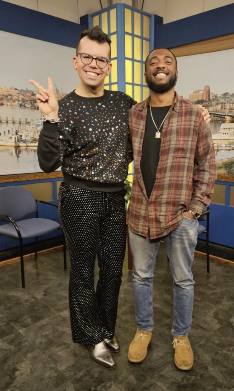
Did you know that I was a guest on the Wake Up New Bedford Podcast? I talk about my journey from being a fitness professional to talking about how I started the journey as a Color Analyst. My episode is broken into two parts and you can watch and listen to them down below.
Did you know that you can host a Private Party with me? This is a fabulous event to do for your employees if you own a business or for a fun girls (or guys) day! Email info@myauthenticcolors.com for more information.
I will be O.O.O from 9/27/25 - 10/8/25 for a work/fun-related vacation to Canada and Chicago. Please plan to book your appointments accordingly!
✨ MINI Appointments: Did you know that I started offering 60-minute Consultations every Tuesday and Friday based on your requests? More time, more insights, more YOU.
📅 Upcoming Events
Here’s where you can catch me next—and yes, I’m bringing the full-color energy:
Westend Grill
📍 New Bedford, MA | 🗓️ August 16th | ⏰ 3PM–7PM
Macy’s NEW
📍 North Dartmouth, MA | 🗓️ September 13th | ⏰ 12PM - 3PM
Gloria & Co
📍 Marion, MA | 🗓️ October 11th | ⏰ 10AM - 3PM
Westend Grill
📍 New Bedford, MA | 🗓️ October 18th | ⏰ 3PM - 7PM
The Seaport Inn NEW
📍Fairhaven, MA | 🗓️ November 9th | ⏰ 11AM - 4PM
Indy Clover Boutique NEW
📍 Wakefield, MA | 🗓️ November 16th | ⏰ 10AM - 1PM
Community Perk: As part of my vibrant community, you can book a 30-minute Color Analysis Consultation for 20% off with a special discount code “BTD20”—for any of my 30-minute Color Analysis Pop-Ups! Physical Products included in my 3-hour Consultation are not included in my Mini Appointments and can be purchased separately.
Don’t miss your chance to get draped and dazzled at a discount!
Today’s Topic: Wearing Color Intentionally (Even If You're a Neutral Lover)
Let me clear something up right away: I don’t hate neutrals. I’m not anti-beige. I’m not here to shame your black-on-black uniform or your capsule wardrobe of oatmeal knits. What I am against is the idea that chic = colorless. That sophistication only comes in shades of gray. That “grown-up” style has to be beige, even if beige makes you feel like you’ve disappeared.
If you’ve ever opened your closet and felt like something was off—but you couldn’t quite name it—it might not be your clothes. It might be your colors.
When Neutrals Go Wrong
We’re in a cultural moment where neutral dressing has been branded as aspirational. It’s minimal. It’s quite luxurious. It’s clean-girl, it’s Parisian, it’s Scandi. And it’s beautiful—on the right person.
But I can’t tell you how many people have come to me saying, “I only wear neutrals, but I feel blah.” Or: “I want to add color, but I don’t know how.” Or: “Beige is supposed to be classy, but on me it just looks... cheap.”
Here’s the thing: even the wrong neutrals can drag you down. Just because black is a wardrobe staple doesn’t mean it’s flattering for everyone. Just because taupe is on-trend doesn’t mean it’s the best backdrop for your natural beauty.
Neutrals are not one-size-fits-all. Your ideal neutral might be warm camel, rich espresso, soft stone, icy gray, or deep navy. It might be white with a touch of cream, not stark optic white. It’s about precision, not more. When you find the right tones—even if they’re soft, even if they’re quiet—they lift you. They harmonize with your skin, your hair, your energy.
Color Isn’t Loud—It’s Alive
Let’s redefine what color means in the wardrobe. It’s not about wearing neon or rainbows (unless that lights you up—then please, go for it). It’s about energy. Color has the power to change how you feel.
A soft rose can make you feel open-hearted and warm.
A deep teal might bring clarity and calm.
A bold coral could energize you from the inside out.
The right color—your color—can be grounding, romantic, empowering, joyful, sensual, or strong. It can wake you up. And yes, it can change your life. Because when you see yourself reflected with vitality, with glow, with resonance, it shifts something inside you. You carry yourself differently. You show up differently.
That’s not superficial. That’s energetic alignment.
Where to Start (If You’re Color-Curious)
You don’t need to overhaul your wardrobe overnight or throw out your favorite black turtleneck. Start small:
Try a scarf, lipstick, or nail polish in your authentic colors that makes your skin glow.
Swap out your daily neutral for a version that fits your undertone.
Try one “hero piece” in a color that excites you, but still feels like you.
This isn’t about becoming someone else. It’s about seeing more of yourself—and letting that person shine.
Color As Self-Expression, Not Costume
People often hesitate to bring in color because they think it’ll be too bold, too loud, “not them.” But color done intentionally never feels like a costume—it feels like truth. It’s a tool for expression, not performance. It doesn't need to shout. Sometimes, the softest blush or the richest brown can say more than the most saturated red—if it’s your color.
So if you’ve been wearing beige because it’s safe, but secretly longing to feel more alive in your clothes, this is your invitation. Your wardrobe doesn’t have to be louder. But it can absolutely be more you.
💖 Swatch This/Scratch That
Welcome to Swatch This / Scratch That. Your weekly scroll through the glossy, the gaudy, and everything in between. I’m serving a mood board of what’s in… and what’s getting cut out. Let’s go!
Swatch This:
🔹 “Wearing the Mood, Not Just the Hue”
Color analysis taught me what flatters my image, but lately I’ve also been playing with what flatters my mood. Some days call for the softness of wearing colors in the Cool Palette like Raspberry & Navy. Other days, it’s a “look-at-me” Poppy Red from the Bright Palette. I’ve started asking, “Does this color speak for me today?” as well as considering the tools I’ve learned in Color Analysis. That shift? It’s making my closet feel less like a rulebook and more like a playlist.
🔸 “Texture as a Power Move”
It’s not just about color—it’s about how it feels. A crisp cotton button-down can say “I’m in charge” just as much as a deep navy blazer. I’m leaning into texture as a way to express strength: buttery leather, raw silk, structured denim. Sometimes, the vibe isn’t about what you’re wearing but how the fabric holds you. Power dressing, but with dimension.
🟢 “Your Season Is a Starting Point, Not a Sentence”
Maybe you got your color analysis back and thought, Wait… I'm a Soft Autumn? And you’ve been living in cool tones your whole life. Been there. But here’s the thing: your season is a foundation, not a fence. You can still wear those colors you love—just tweak the intensity, pair them with a flattering tone, or shift the undertone slightly. It’s not about giving things up. It’s about getting smarter with how you wear them. Color analysis isn’t about boxing you in—it’s about unlocking more ways to feel like you in what you wear.
Scratch That:
The Madeira Feast.
Yup…I said it. I do not like the Madeira Feast. I’m Portuguese, but do not like Portuguese Food, or feeling like I’m at my high school reunion. No thanks.
“One Size” Clothing
“One size fits all” is the biggest myth in fashion since low-rise jeans were flattering on everyone. Clothes that claim to work for everybody rarely work for anybody. Fit is not universal—it’s personal. Give me a size range, give me a stretch panel, give me options. Because the only thing that should be one-size-fits-all is respect.
Shoes You Can’t Walk In
Look, I will bear a little bit of pain to look good. But if I have to bring a backup pair in my bag, the shoe has failed. I want a style that moves with me—literally. We’re done with 4-hour shoes in a 12-hour world.
🎨 The Color Connection
This week, we’re settling into the understated sophistication and serene strength of gray—a hue that speaks in tones of stillness, balance, and quiet refinement. If brown roots us and black commands, then gray holds space—it bridges contrasts, tempers intensity, and brings a cool, modern calm to any palette.
Gray is the color of fog-draped mornings, worn stone, brushed steel, and soft wool. It’s timeless and versatile, with the power to be both bold and barely there. Whether you’re a Cool Summer or a True Winter, there’s a version of gray that mirrors your natural elegance and clarity.
Let’s explore gray not just as a neutral, but as a symbol of subtle power, grace under pressure, and elevated simplicity. 🩶
🎨 Color Theory: Gray
Neutral Hue: Gray is a mix of black and white, but its temperature can shift depending on the presence of undertones—blue, violet, green, or even brown.
Color Temperature:
Cool Grays: Slate, silver, charcoal—crisp, modern, and serene.
Warm Grays: Dove, greige, stone—softer, more organic, and inviting.
Visual Characteristics: Muted, balanced, and versatile. Gray adapts easily—grounding brights, softening darks, or enhancing pastels.
Complementary Pairing: Works beautifully with most colors. Try charcoal with blush, dove gray with olive, or greige with soft gold.
🧠 Psychology of Gray
Emotional Associations:
Balance & Neutrality: Sits between extremes—never too loud or too soft.
Wisdom & Maturity: Suggests composure, subtle strength, and thoughtfulness.
Elegance & Restraint: A favorite in minimalist and high-end aesthetics.
Physiological Effects:
Calms overstimulation.
Encourages focus and mental clarity.
Creates an atmosphere of quiet sophistication.
Cultural Significance:
Western Cultures: Often represent professionalism, discretion, and cool authority.
Fashion & Interiors: Known for versatility—chic in both casual and formal contexts.
Spiritual Symbolism: Associated with humility, detachment, and inner reflection.
Marketing & Branding:
Common in luxury, tech, and wellness brands (e.g., Apple, Aesop, Everlane).
Suggests trust, innovation, and modernity.
Often used to convey timelessness and neutral objectivity.
🌫️ What’s Every Season’s Best Gray?
Gray may seem simple, but the right tone can elevate your natural coloring with effortless elegance.
True Spring: Dove Gray
True Autumn: Mushroom
True Summer: Nickel
True Winter: Charcoal
Warm Spring/Autumn: Warm Gray
Cool Summer/Winter: Aluminum
Bright Winter/Spring: Albane Gray
Deep Autumn/Winter: Iron Gray
Light Spring/Summer: Pearl Gray
Soft Summer/Autumn: Fog
Gray is the color of reflection, neutrality, and refined beauty. Whether it's the softness of dove gray or the weight of slate, it offers a grounding presence—never overpowering, yet always present.
✨ Up next in our Color Connection series: Black—and its chic alternatives.
From jet to soft ink, rich navy to deep charcoal, we’ll explore how to wear this iconic color and its counterparts in a way that honors your palette, personality, and presence. 🖤
💸 Discount of the Week
This August, I’m doing things a little differently—and a little more celebratory! To mark my birthday month, I’m treating my Behind the Drapes community to an exclusive gift: My Birthday Discount is available to you all month long!
While the general public will only have access to this special offer from August 12th to 14th, you—my loyal readers and clients—get early and extended access for the entire month of August.
✨ Here’s the Deal: Enjoy 32% off any In-Person or Virtual Color Analysis Consultation ALL MONTH LONG!
Use code HAPPYBDAYMAC at checkout to claim your discount.
Whether you’ve been thinking about discovering your season or want to refine your color journey, now is the perfect time to treat yourself (and maybe a friend!) to a personalized color experience. Please do not share this code
Thank you for being part of my community—celebrating another year feels even more special with you in it. 💛
✨ Offer valid through Sunday, August 31st, 2025 at 11:59 PM EST
💌 Let’s Keep the Conversation Going
Thanks for spending time Behind The Drapes. I’ve got so much more in store, and I want your input! Do you have a burning-style question? A favorite color combo? A topic you’d love me to cover next? Email me your ideas at info@myauthenticcolors.com—I’m all ears (and full spectrum lighting).
If you haven’t followed me on Instagram yet, this is where I hang out the most! I’m pretty cool on there if I say so myself.
Until next time, keep shining in your authentic colors. 🌈
With color and care,
Mac Carvalho
CEO, My Authentic Colors


