
Chapter 11: Not Every Store Has to Be for Everybody — And That’s Okay.
Welcome to the eleventh edition of Behind The Drapes—your exclusive, all-access pass to everything going on behind the scenes at My Authentic Colors. Can you believe that I made it consistently 10 weeks in a row with free educational (& hopefully entertaining) content for all of you? To be honest, I did not think that I could do it, but here we are! This isn’t just about fashion; it’s about uncovering who you are and expressing that with confidence and joy. Whether you're a longtime color enthusiast or just beginning your style journey, I’m so glad you’re here.
🏡 Studio Updates
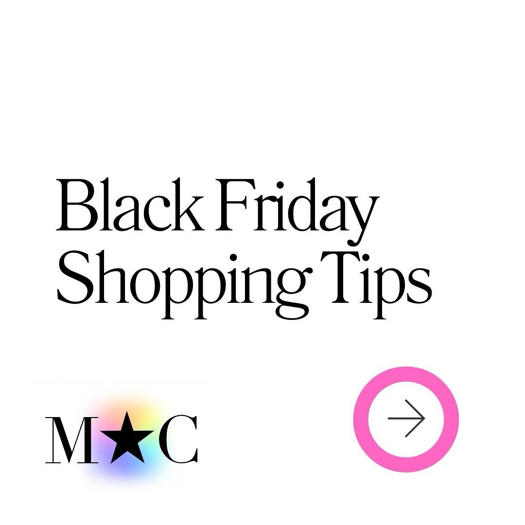
1st Annual Black Friday in July Is Here! 🖤🔥
From 7/21 to 7/31, snag incredible deals on my most popular sessions:
Mini Sessions (60 minutes) for just $75 (regularly $175)
Full 3-Hour Sessions for $175 (regularly $300)
Pop-Up Events now $60 (regularly $100)
Please note: Special discount codes won’t be available until the sale starts and cannot be applied during this event. This is your chance to treat yourself without breaking the bank—don’t miss out!
✨ GIFT CARDS NOW AVAILABLE! You can now purchase Gift Certificates on the website! Here are some directions on how you can purchase Gift Certificates
Head to my website www.myauthenticcolors.com
Click on the Top Right corner and click on “Color Analysis Consultations.”
Click on “Book an In-Person Color Analysis Consultation.”
Scroll to the bottom, where you will find Gift Certificates under “Products & Packages.”
We only have Gift Certificates for the full amount of our Full 3-Hour and Mini (60) Color Analysis Consultations at this time.

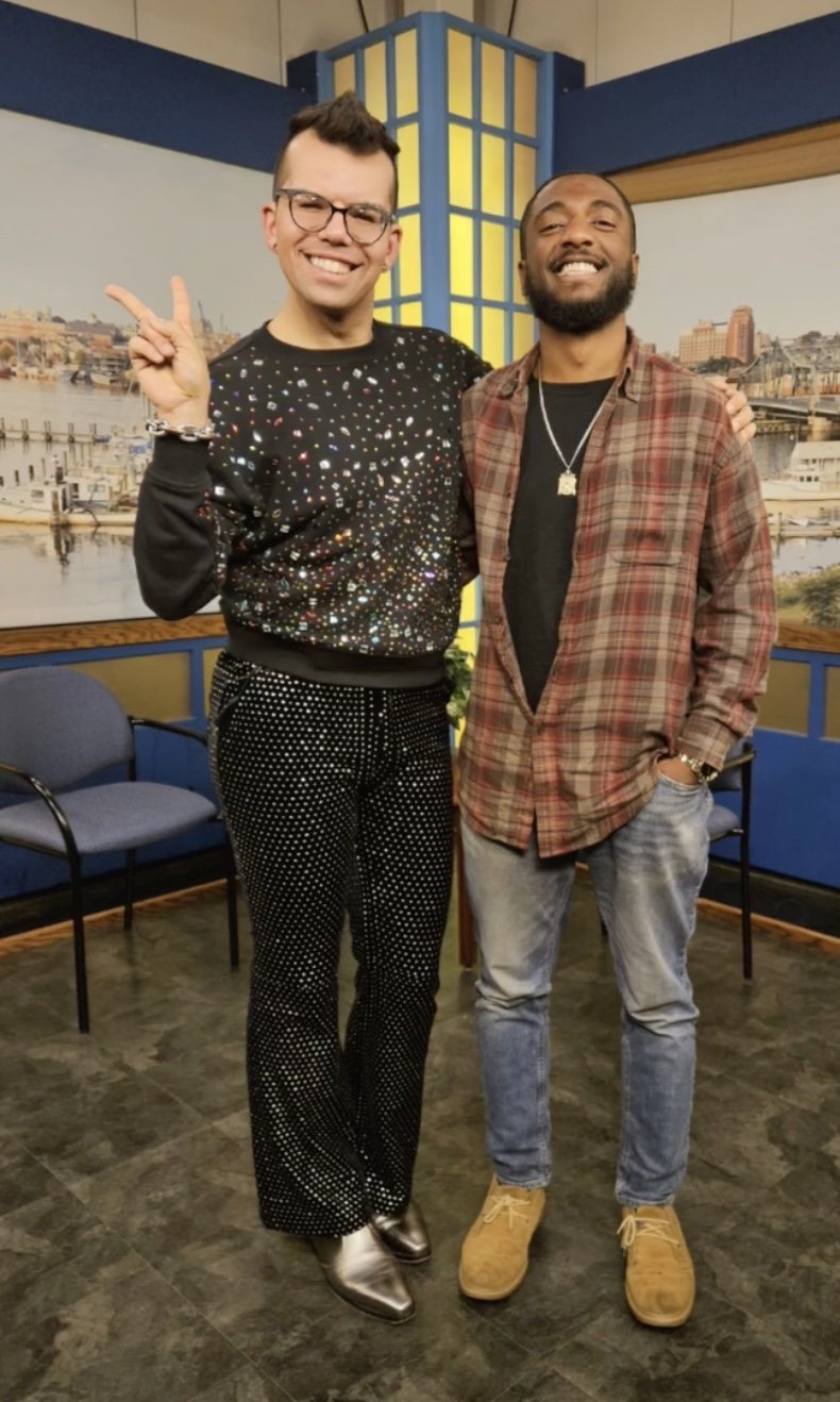
Did you know that I was a guest on the Wake Up New Bedford Podcast? I talk about my journey from being a fitness professional to talking about how I started the journey as a Color Analyst. My episode is broken into two parts and you can watch and listen to them down below.
Did you know that you can host a Private Party with me? This is a fabulous event to do for your employees if you own a business or for a fun girl’s (or guys) day! Email info@myauthenticcolors.com for more information.
I will be O.O.O from 9/27/25 - 10/7/25 for a work/fun-related vacation to Canada and Chicago. Please plan to book your appointments accordingly!
✨ MINI Appointments: Did you know that I started offering 60-minute Consultations every Tuesday and Friday based on your requests? More time, more insights, more YOU.
📅 Upcoming Events
Here’s where you can catch me next—and yes, I’m bringing the full-color energy:
Diversity Consignment
📍 Jamaica Plain, MA | 🗓️ July 26th | ⏰ 11:30pm-7:30pm
Boutique on the BuyWay
📍 Falmouth, MA | 🗓️ July 31st | ⏰ 4PM - 7PM
Back To School Event at Westend Grill
📍 New Bedford, MA | 🗓️ August 16th | ⏰ 3PM–7PM
Gloria & Co
📍 Marion, MA | 🗓️ October 11th | ⏰ 10AM-3PM
Halloween Extravaganza at Westend Grill
📍 New Bedford, MA | 🗓️ October 18th | ⏰ 3PM–7PM
Community Perk: As part of my vibrant community, you can book a 30-minute Color Analysis Consultation for 20% off with a special discount code “BTD20”—for any of my 30-minute Color Analysis Pop-Ups! Physical Products included in my 3-hour Consultation are not included in my Mini Appointments and can be purchased separately.
Don’t miss your chance to get draped and dazzled at a discount!
Today’s Topic: Not Every Store Has to Be for Everybody — And That’s Okay
This might ruffle a few feathers, but I’ve been sitting with this for a while, and it’s time to talk about it.
We live in a world where “inclusive” has become the gold standard. Every brand, every store, every campaign is expected to cater to everybody, every size, every identity, every budget. While I believe in dignity, visibility, and access, I don’t believe that every store has to be for everyone.
There. I said it.
Now, before the torches come out…Let me be crystal clear: I am not against size inclusivity. I’m a huge advocate for representation. I know what it’s like to walk into a store and feel invisible. To see a rack full of things that weren’t made with your body, your culture, your vibe, or your needs in mind.
But here's the thing: not every brand has to try to be everything to everyone. Why? Because authenticity matters. Niche matters. Artistic vision matters. When a designer or brand has a very specific look, aesthetic, or point of view—and they want to cater to a particular demographic—it’s not automatically exclusionary. Sometimes it’s just clarity. It’s knowing your lane and staying in it, because that’s where your passion lives.
Everyone doesn't have to sit at every table.
This idea that if a store doesn’t carry a size 28, or doesn’t have adaptive clothing, or doesn’t include the “XYZ” group, they’re automatically evil or discriminatory? That’s too simplistic. We’ve flattened everything into black and white when the truth lives in the nuance. Some brands aren’t equipped—financially, logistically, or even creatively—to serve every market. When they try to out of guilt or pressure, it often feels shallow or performative. That’s not inclusion—that’s appeasement.
Every business has a target audience, and that’s a good thing.
Some businesses are exclusively plus-size. Others cater only to petites. Some focus entirely on mature women or Gen Z streetwear. Some stores only serve male clients. That’s not limiting—it’s focused. That’s a business that knows exactly who they’re talking to and how to serve them best. That’s a brand saying, “We see you. We understand you. We made this just for you.” Torrid, for example, only caters to plus-size women. They know what customer they are serving, and one could argue that they do not cater to smaller-framed women. But we know as a society what that brand is about and do not question it, do we?
Honestly, I love that.
In my body shape sessions for Personal Styling, I will be talking a lot about dressing for your specific frame—whether that’s an X, A, V, H, O, or Standard body type. When a store is designed with a particular shape in mind, they’re not leaving everyone else out—they’re just going deep rather than wide. That’s the intention.
The same goes for style personalities. A brand might be all in on the Dramatic—bold lines, strong shoulders, major silhouettes. Others are made for the Creative—unexpected patterns, clashing colors, art-school energy. And then some brands are all about Classic, or Feminine, or Relaxed.
If a store has a strong identity, it’s okay that they don’t hit every note on the style personality scale. It means they know who they are—and who they’re for. When we design for everybody, we cater to nobody. Let that one sink in.
We need more diverse brands, not just more inclusive ones.
Let’s stop pressuring every single store to do it all. What we need are more brands run by more kinds of people—people of different sizes, backgrounds, gender identities, aesthetics, and experiences—so we naturally have more choices across the board.
Let luxury brands serve their fantasy. Let indie brands explore weird niche shapes. Let Black-owned brands create specifically for Black bodies without having to explain themselves. Let queer-run boutiques make art that speaks to the queer community first.
Everyone deserves options, but that doesn’t mean every store has to be your option.
Here's what I want instead:
More truth-telling in fashion.
More unapologetic niche creators.
More love poured into what you do instead of guilt for what you don’t.
And a little less shaming of brands that aren’t trying to be for everyone.
We need both space and specificity. That’s the balance. That’s where the color lives.
And that’s what “Behind the Drapes” is all about.
Stay bold, stay weird, stay honest.
💖 Swatch This/Scratch That
Welcome to Swatch This / Scratch That. Your weekly scroll through the glossy, the gaudy, and everything in between. I’m serving a mood board of what’s in… and what’s getting cut out. Let’s go! This week, I’m getting personal with things in my own life that I would love to see more of, and what I would love to see less of. Some are pet peeves, some are my ride or dies, and some are in-between. Let’s go.
Swatch This:
Less Doom Scrolling on Social Media.
I used to scroll like it was second nature—wake up, grab my phone, get sucked into an endless loop of content I didn’t ask for and didn’t need. It started as “just checking in” and ended with me feeling drained, distracted, and weirdly anxious. These days, I still use social media—but with purpose. It’s a tool for my business, not a black hole I fall into. I'm more intentional, more aware, and a lot more grounded. The best part? I finally feel like I’m in control of the app, not the other way around. I love seeing other people feeling the same way about social media.
A Good Cold Brew.
There’s something about a good cold brew that feels like a little victory in a cup. It’s bold, smooth, ice-cold magic that somehow kickstarts my brain and my mood. But let’s be real—making it at home? Never quite the same. I’ve tried the jars, the fancy gadgets, the overnight rituals… and nope. Still doesn’t hit like the one from my favorite café, handed to me with just the right amount of smug satisfaction. It’s not just a drink—it’s a ritual, a reward, and a tiny luxury I fully stand behind.
Leaving the Mall Empty-Handed—and Feeling Empowered
Walking out of the mall with zero bags used to feel like a fail, but now, it feels like clarity. Since diving into personal styling and color analysis, I’ve gotten good at knowing what works for me—and what doesn’t. I’m no longer grabbing random “cute” pieces that clash with my undertone or don’t fit my style goals. If nothing aligns with my palette, body shape, or vibe? I’m out, no guilt, no FOMO. It’s not about buying less—it’s about buying smarter. And sometimes, the smartest buy is no buy at all.
Scratch That:
Micromanaging…
Let’s get one thing straight: I love constructive feedback. Seriously—if it helps me grow or makes my business better, bring it on. But micromanaging? That’s a whole different beast. It's not helpful, it’s controlling. It’s like hiring a chef and then standing over their shoulder telling them how to chop onions. If you don’t trust me to do what I’m good at, why am I even here? Guide me, challenge me, collaborate with me—but don’t hover. I’m building something, not babysitting your insecurities.
Love Island Sucks.
I’ve tried. I have. But watching Love Island feels like losing brain cells in real time. It's a bunch of overly tanned people whispering sweet nothings and playing musical chairs with each other’s love lives while pretending it’s all very deep and meaningful. Spoiler: it’s not. The drama feels manufactured, the conversations are recycled, and somehow, it's on every night. I get that it's supposed to be trashy fun, but I like my trash with at least a hint of self-awareness. If I wanted to watch emotionally stunted people flirt badly, I’d just reopen my dating apps.
Paying to Use the Beach
I’ll never get over the fact that we have to pay to use a beach during the summertime. Like… It’s the ocean. It was here before property lines and parking fees. The idea that nature—something that should be free and accessible to everyone—now comes with a ticket price, a turnstile, and probably a surcharge for shade? Ridiculous. I’m not asking for a cabana and cold drinks, just some shoreline without a cover charge. Let people touch sand without needing small change, please.
🎨 The Color Connection
This week, we’re embracing the serene strength and luminous simplicity of one of the most quietly commanding hues—white. If black grounds with mystery and blue soothes with depth, then white clears space with light, calm, and quiet power. It’s the color of fresh snow, crisp linen, and soft morning light—pure, honest, and infinitely expressive.
What makes white so compelling is its emotional range: it can be stark or soft, minimal or luxurious. Whether you’re a Cool Summer or a True Winter, there’s a white in your palette that speaks of grace, presence, and inner clarity.
Let’s explore white not just as a symbol of simplicity, but as a color of peace, refinement, and unwavering strength. 🤍
🎨 Color Theory: White
Neutral Hue: White isn’t found on the color wheel—it’s the presence of all light and the absence of pigment. In design and fashion, it's often used as a neutral base or a clean contrast.
Color Temperature: Can skew cool (think icy or bluish whites) or warm (like ivory or cream). Each carries a distinct mood.
Visual Characteristics: Crisp, clean, and luminous. White conveys purity, precision, and emotional balance.
Complementary Pairing: Works with nearly every color, but shines especially next to deep hues or earth tones (think ivory with chocolate brown or snow white with navy).
Cool White: Icy white, bright snow—sharp, modern, and fresh.
Warm White: Ivory, eggshell—soft, romantic, and natural.
🧠 Psychology of White
Emotional Associations:
Clarity & Simplicity: Invites mental space and minimalism.
Purity & Peace: Often associated with renewal, beginnings, and truth.
Openness & Precision: Encourages honesty and focus.
Physiological Effects:
Creates a sense of spaciousness and calm.
It can enhance light and clarity in visual spaces.
Supports a sense of order and mindfulness.
Cultural Significance:
Western Cultures: Linked with weddings, new beginnings, and cleanliness.
Eastern Cultures: In some countries (e.g., China, Korea), white represents mourning and respect.
Global Views: Often symbolizes peace (e.g., white dove), healing, and sacredness.
Marketing & Branding:
Favored in tech, wellness, luxury, and minimalist design.
Conveys sophistication, purity, and trust (e.g., Apple, The Row, Goop).
Often used to communicate elegance, clarity, and premium quality.
🌿 What’s Every Season’s Best White?
White is endlessly adaptable—every undertone and shade expresses a different kind of elegance. Whether warm or cool, it adds light and lift to any palette.
True Spring: Cream
True Autumn: Ecru
True Summer: Off White
True Winter: Ice White
Warm Spring/Autumn: Vanilla
Cool Summer/Winter: Milk White
Bright Winter/Spring: Bright White
Deep Autumn/Winter: Stone White
Light Spring/Summer: Ivory
Soft Summer/Autumn: Alabaster White
White is the color of honesty, intention, and quiet power. Whether it’s used as a gentle whisper or a crisp statement, white invites us to see clearly and feel deeply.
✨ Up next in our Color Connection series: Brown—a color of grounding, wisdom, and understated richness. From soft camel to deep espresso, brown reminds us of resilience, earthiness, and enduring warmth. 🤎
💸 Discount of the Week
No secret discount this week or next! Enjoy my 1st Annual Black Friday in July Sale with the best prices I’ve ever offered!
✨ Offer valid through Sunday, July 31st, 2025 at 11:59 PM EST
💌 Let’s Keep the Conversation Going
Thanks for spending time Behind The Drapes. I’ve got so much more in store, and I want your input! Do you have a burning-style question? A favorite color combo? A topic you’d love me to cover next? Email me your ideas at info@myauthenticcolors.com—I’m all ears (and full spectrum lighting).
If you haven’t followed me on Instagram yet, this is where I hang out the most! I’m pretty cool on there if I say so myself.


Until next time, keep shining in your authentic colors. 🌈
With color and care,
Mac Carvalho
CEO, My Authentic Colors