
Chapter 6: Are You Scared to get a Color Analysis?
Welcome to the sixth edition of Behind The Drapes—your exclusive, all-access pass to everything going on behind the scenes at My Authentic Colors. This isn’t just about fashion; it’s about uncovering who you are and expressing that with confidence and joy. Whether you're a longtime color enthusiast or just beginning your style journey, I’m so glad you’re here.
🏡 Studio Updates
✨ GIFT CARDS NOW AVAILABLE! You can now purchase Gift Certificates on the website! Here’s some directions on how you can purchase Gift Certificates
Head to my website www.myauthenticcolors.com
Click on the Top Right Hand Corner and click on “Color Analysis Consultations”
Click on “Book an In-Person Color Analysis Consultation”
Scroll to the bottom where you will find Gift Certificates under “Products & Packages”
We only have Gift Certificates for the full amount of our Full 3 Hour and Mini (60) minute Color Analysis Consultations at this time.

Did you know that you can host a Private Party with me? This is a fabulous event to do for your employees if you own a business or for a fun girl’s (or guys) day! Email info@myauthenticcolors.com for more information.
✨ MINI Appointments: Did you know that I started offering 60-minute Consultations every Tuesday and Friday based on your requests? More time, more insights, more YOU.
📅 Upcoming Events
Here’s where you can catch me next—and yes, I’m bringing the full-color energy:
Gloria & Company
📍 Marion, MA | 🗓️ June 20th | ⏰ 12PM–6PM
Pretty Boutique MedSpa
📍 Westport, MA | 🗓️ June 21st | ⏰ 3PM–7PM
Books & Bulldogs Market Pop-Up
📍 Norwood, MA | 🗓️ June 28th | ⏰ 10AM–5PM
Summer Jam Pop Up at Westend Grill
📍 New Bedford, MA | 🗓️ July 12th | ⏰ 3PM–7PM
Diversity Consignment NEW!
📍 Jamaica Plain, MA | 🗓️ July 26th | ⏰ TBD
Boutique on the BuyWay NEW!
📍 Falmouth, MA | 🗓️ July 31st | ⏰ 4PM - 7PM
Community Perk: As part of my vibrant community, you can book a 30-minute Color Analysis Consultation for 20% off with a special discount code “BTD20”—for any of my 30-minute Color Analysis Pop-Ups! Physical Products included in my 3-hour Consultation are not included in my Mini Appointments and can be purchased separately.
Don’t miss your chance to get draped and dazzled at a discount!
Today’s Topic: Are You Scared to get a Color Analysis? You're Not Alone — Here's How to Overcome It.
So, you've been thinking about getting a color analysis, but every time you're about to take the plunge, something stops you. Maybe it's the price tag. Maybe it’s the fear of being told you can’t wear black. Or maybe you're worried it’ll put you in a box and steal the joy from getting dressed.
If any of that sounds familiar, you're not alone. It’s totally normal to feel nervous about something that feels so personal. Color Analysis isn’t just about clothes — it touches on identity, self-expression, and how you want to be seen in the world. That’s a big deal! But it doesn’t have to be scary. Let’s walk through some common fears and how to work through them.
1. “It’s so expensive.”
You're right — a professional color analysis is an investment and a luxury service. But here's the truth: it can actually save you money in the long run. How many things are sitting in your closet with tags still on? How many impulse buys have ended in disappointment? Once you know your colors, shopping becomes easier, more intentional, and way less wasteful. You stop buying things that don’t work — and that alone can pay for the analysis over time.
Tip: Think of it like a wardrobe roadmap. It's a one-time investment that pays off with every outfit you feel confident in.
2. “I’m afraid you’ll tell me I can’t wear black.”
This is probably the most common fear. Black feels safe, classic, and easy. But here’s the thing — a good color analyst like myself won’t ban anything. The goal isn’t to restrict you, but to empower you. Yes, some people look better in softer neutrals or rich browns or deep navies, but if black makes you feel amazing? Wear it. The analysis just helps you understand how to wear it in a way that works best for you — maybe with the right makeup, contrast, or accessories.
Tip: Remember, Color Analysis is a tool, not a rulebook.
3. “What if I feel limited afterward?”
A color palette isn’t meant to put you in a style prison — it’s a jumping-off point. The palettes I provide my clients post FULL Color Analysis sessions contain 36 colors, including versions of hues you probably already love. And if there’s a color in your palette that you do not love, you don’t have to wear it. This is about creating harmony between your natural coloring and your wardrobe, not boxing you into a look you don’t like.
Tip: Use your palette as a guide, not a restriction. Think of it like cooking — just because you know the best spices for a dish doesn’t mean you can’t try something new.
4. “I’m set in my ways. What if I just want to wear whatever makes me happy?”
Great! You should wear what makes you happy. Style first and foremost should always feel authentic to you! Color Analysis isn’t about taking joy away from dressing — it's about enhancing it. Sometimes, what makes us feel good is comfort and familiarity, and sometimes it’s feeling seen and radiant. Color Analysis can bridge the two by helping you find versions of your favorite colors that flatter you even more.
Tip: Consider it a self-care experience — not a makeover, but a rediscovery of what already makes you shine.
5. “What if I don’t like the results?”
It’s a valid concern. But a good analyst will always explain why certain colors work better and show you how to adapt. Many people go in expecting one thing and are surprised — in a good way. Trust me, there isn’t a session that I’ve done where a client isn’t shocked about their results. You might discover that the colors that actually make your skin glow, your eyes pop, and your confidence rise aren’t the ones you’d have picked off the rack… but now you wouldn’t go back.
Tip: Be open-minded and curious. You don’t have to love every color in your palette — just find the ones that feel good and build from there.
Final Thoughts: Fear Is Normal — But You Deserve to Feel Amazing
Getting a color analysis is like holding up a mirror — not to judge yourself, but to understand yourself better. It's okay to feel hesitant. But what’s on the other side is often clarity, confidence, and a new way to see yourself.
So if you’ve been sitting on the fence, consider this your gentle nudge. Not because you need it — but because you deserve to feel good in your skin and your style.
💖 Swatch This/Scratch That
Welcome to Swatch This / Scratch That. Your weekly scroll through the glossy, the gaudy, and everything in between. I’m serving a mood board of what’s making the cut… and what’s getting cut out. Let’s dive in.
Swatch This:
Parents gifting their kids a Color Analysis
Parents who want their kids to invest in their style as they go into their high school or college years is amazing! Great time to start your colorful journey and to beat following the trends of your peers.
Skinny Jeans coming back on trend.
This might be a contraversial take, but I am happy to see that skinny jeans are on the rise. Do not get me wrong, I love a wide leg trouser and is a current silhouette that isn’t going anywhere. But skinny jeans do work for my body type and flatter my legs and bum more so than a wde leg pant. They’re not the same as they were in the mid-2000’s but they’re back and be prepared to see them again in stores!
Getting rebooked for events.
I love working with local businesses to spread the love of color and it makes me happy when they ask me to come back based on your requests!
Scratch That:
Bullying… Especially towards my clients.
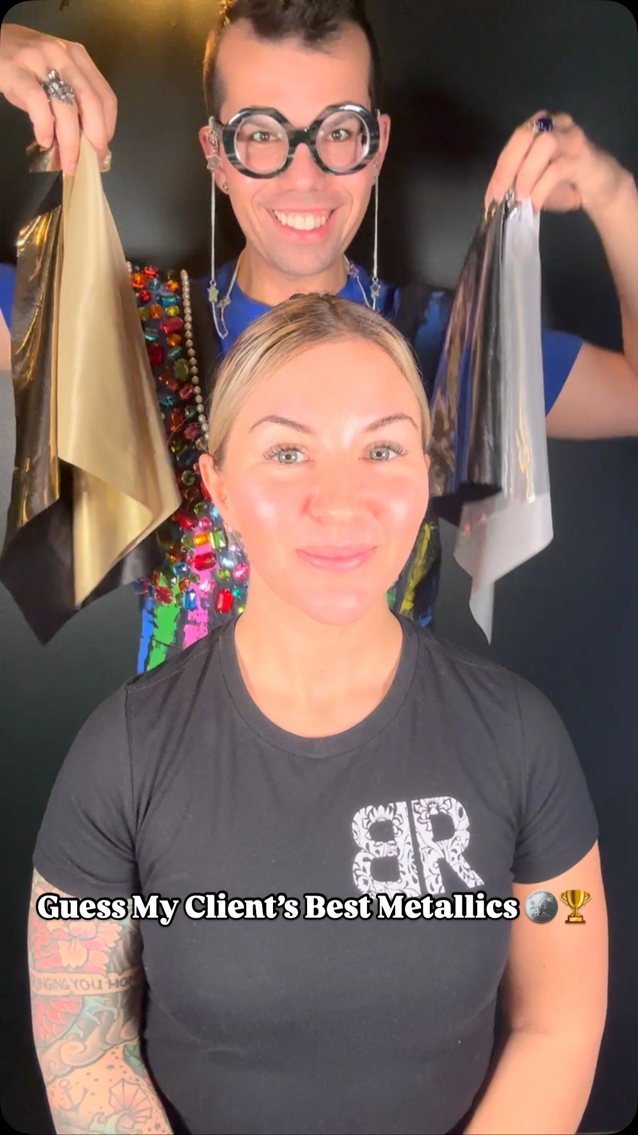
I made a statement on my stories on Instagram after I saw some comments talking about a client’s appearance. This is something that I could do an entire blog on but this is something that should be scratched entirely for society. Just no… I always respect the privacy of my clients and it is a vulnerable thing to ask someone to be on camera makeup free and covered in a white cape and head scarf. So to then comment on my clients appearance is just gross and slimy.
Overpriced Food Court Food.
My partner and I had to go to Nespresso to buy some coffee. I had just came out of my event with Diversity and he mentioned going to Wegmans. We used to go all the time when Neiman Marcus was at the Natick Mall and was our go to stop to eat. They’re sandwiches and salad bars are so good but by the time we got there, they closed! I was sad. So I saw the Chinese food that they had out on display and I have not had Asian Cuisine in a long time so I said why not? First off, it was over 30 bucks for one of our meals that we got…. and it was not even good! It tasted like food court chinese and if you had food court chinese, you know the taste! We could’ve went to a restaurant for less than that! So I do not recommend!
The Dad Jort Trend
The current trend in terms of shorts right now are the baggy, 9 inch inseam dad jort. These in my opinion are meant for people who are tall. Petite clients, I struggle to see you wear this trend in an effortless way. They may be in right now but I do see this as a fad and will be on the decline come next season. There are other styles of shorts that will work for you that can withstand the trend!
🎨 The Color Connection
This week, we’re basking in the glow of the most luminous, optimistic hue on the color wheel—yellow. If orange radiates warmth and boldness, yellow sings with light, clarity, and cheer. It’s the color of sunshine, curiosity, and intelligence—and unlike orange, there’s a shade of yellow for everyone.
Here’s what makes yellow truly fascinating: it can be warm, cool, and neutral. That flexibility means that whether you’re a Cool-toned Summer or a warm-toned Autumn, there’s a yellow in your palette waiting to shine.
Let’s explore yellow not just as a bright pop, but as a nuanced and expressive color that adapts to its surroundings—and its season. ☀️
🎨 Color Theory: Yellow
Primary Color: One of the three primaries, alongside red and blue. Pure yellow has no added cool or warm pigment—until it's modified.
Color Temperature: Can lean warm (goldenrod, marigold) or cool (lemon, buttercream), depending on undertones and pairings.
Visual Characteristics: Advancing and attention-grabbing. It’s the lightest hue in the spectrum, making it inherently bright and uplifting.
Complementary Color: Purple. This pairing creates an electric, high-contrast balance.
Tint (Yellow + White): Cream, butter, pastel yellow—soft and delicate.
Shade (Yellow + Black): Mustard, ochre—grounded and vintage.
Tone (Yellow + Gray): Muted honey, straw—sophisticated and subtle.
🧠 Psychology of Yellow
Emotional Associations:
Optimism & Joy: Evokes sunlight, hope, and happiness.
Curiosity & Creativity: Linked to intellect and idea generation.
Alertness: Used in caution signs for its visibility and energy.
Physiological Effects:
Stimulates mental activity and communication.
Can uplift mood and create a sense of brightness in a space.
Cultural Significance:
Asia: In some cultures, yellow is imperial or sacred.
Western Cultures: Symbolizes youth, energy, and freshness.
Egypt: Historically associated with gold and eternity.
Marketing & Branding:
Found in cheerful, optimistic brands (e.g., IKEA, McDonald's, Post-it).
Common in children’s products, tech, and food for its visibility and positivity.
🌈 What’s Every Season’s Best Yellow?
Unlike orange, yellow has a version for every season—but tone, temperature, and clarity are key.
True Spring: Daffodil
True Autumn: Mustard
True Summer: Pale Yellow
True Winter: Neon Yellow
Warm Spring/Autumn: Sunflower.
Cool Summer/Winter: Light Lemon
Bright Winter/Spring: Lemon Yellow
Deep Autumn/Winter: Dark Lemon Yellow
Light Spring/Summer: Lemon Chiffon
Soft Summer/Autumn: Yellow Flax
Yellow is a color of nuance, range, and adaptability. Whether you wear it as a soft accent or a signature statement, there’s a yellow that will work with your natural coloring and energy.
Up next in our Color Connection series: Green—a color of balance, renewal, and surprising range from icy mint to earthy olive. 🌿
💸 Discount of the Week
🎉 Discount Code: HELLOYELLOW
Get $65 OFF your 1 Hour Color Consultation ONLY—because your style should shine as brightly as your personality. ☀️✨
Valid through June 22nd, 2025 at 11:59 PM EST
💌 Let’s Keep the Conversation Going
Thanks for spending time Behind The Drapes. I’ve got so much more in store, and I want your input! Do you have a burning-style question? A favorite color combo? A topic you’d love me to cover next? Email me your ideas at info@myauthenticcolors.com—I’m all ears (and full spectrum lighting).
If you haven’t followed me on Instagram yet, this is where I hang out the most! I’m pretty cool on there if I say so myself.

Until next time, keep shining in your authentic colors. 🌈
With color and care,
Mac Carvalho
CEO, My Authentic Colors